Logo Input

jason

Seanchaí
Staff member
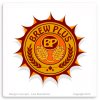
The Washington one.
I just think it looks the best.
I like washington as it almost reminds me of a bottle top. I can ask them to do the sides more like one. Not real sure how I feel about the BP in the middle though. I wonder if I should take that out, or replace it with something else.
 

jason

Seanchaí
Staff member
nixon..................
Another one I like. Really nothing that I can think of that needs to be changed. The amount of colors though may make it little hard to brand in the future. Usually the more colors, the more it costs to have embroidered or transferred onto items. Something I learned about with the outdoorbasecamp.com logo. Not to mention all the little trees are hard to have embroidered.
 

Attachments

jason

Seanchaí
Staff member
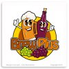
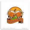
I've sort of narrowed it down some. I like washington like I said before, maybe better with the changes. Not much of a fan of Grant. Almost wondering about putting in hops and grapes maybe into the center of Hayes and removing the mugs. But that may confuse people. Nixon is not bad, but transferring to items may be costly in the future. Carter is bright and colorful. Draws attention. But lots of color again means higher product costs. Not to mention the detail that would be involved. Ok, so maybe all I've done is taken out grant.
 

Bob Franks

Past District Deputy Grand Lecturer
Washington? Nixon? No idea what you're referring to.
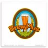
I like the one with the single glass in the middle.

S&F
 
Top